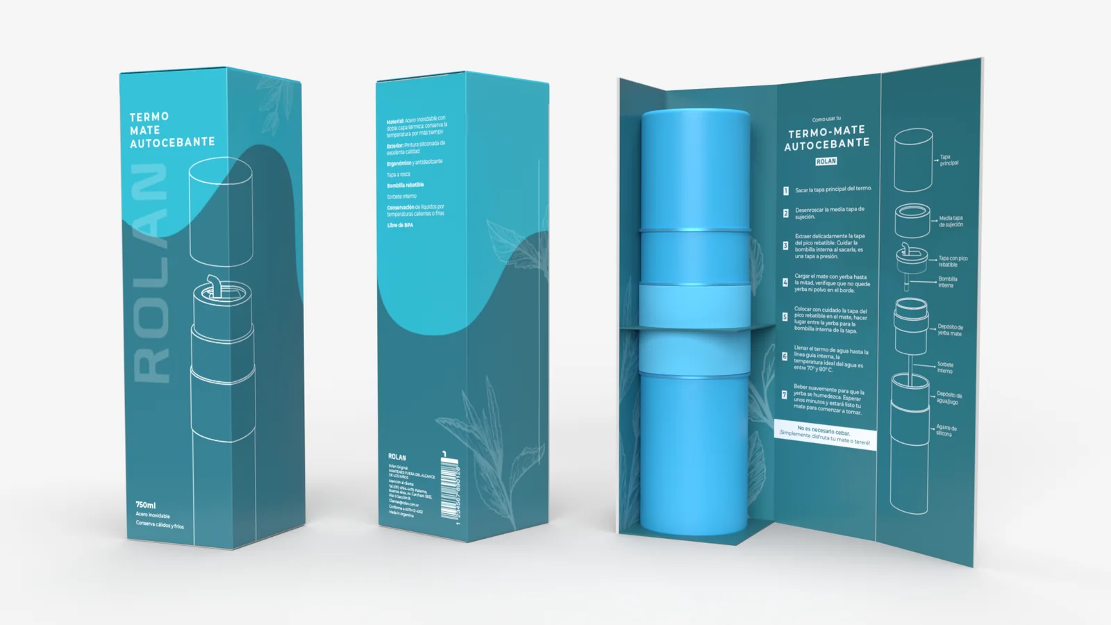
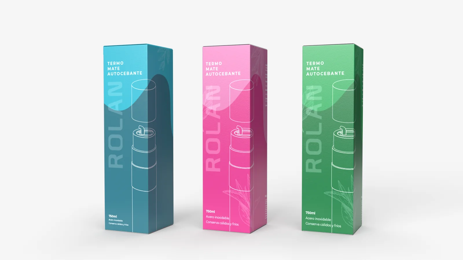
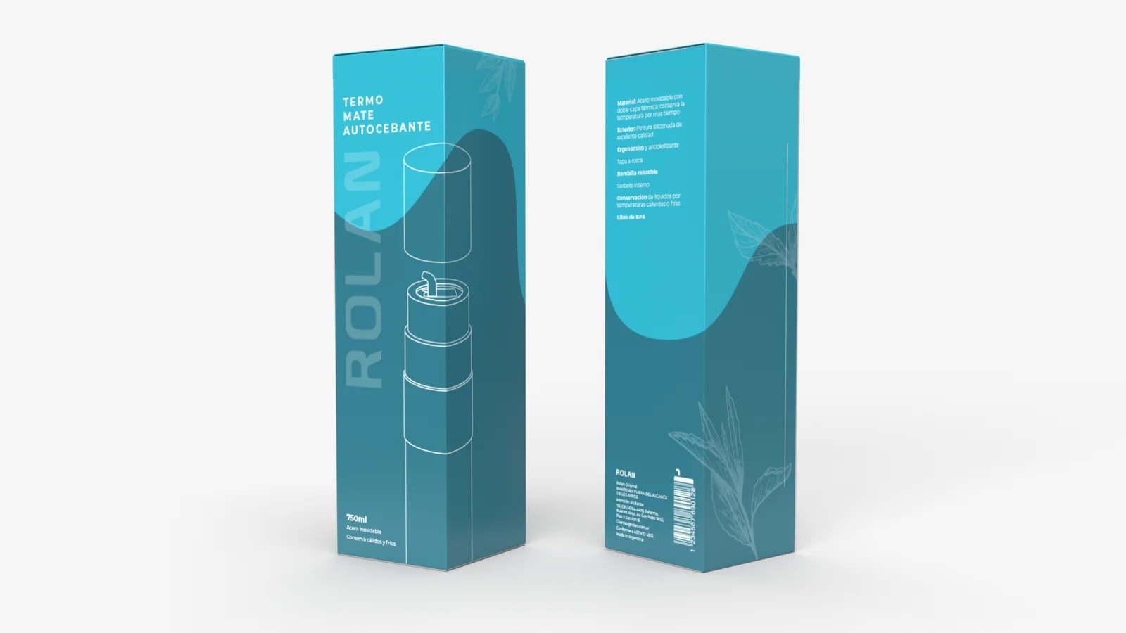
Packaging concept for an Argentine self-brewing thermos. A vertical box with a clean two-tone gradient, white line illustrations of the modular components, and botanical yerba mate motifs layered into the background. Designed as a full range — teal, magenta and green variants share identical layout logic, making colour the sole SKU differentiator. The interior panel turns unboxing into a guided onboarding moment with numbered steps and exploded-view diagrams that reinforce the product's autocebante innovation.
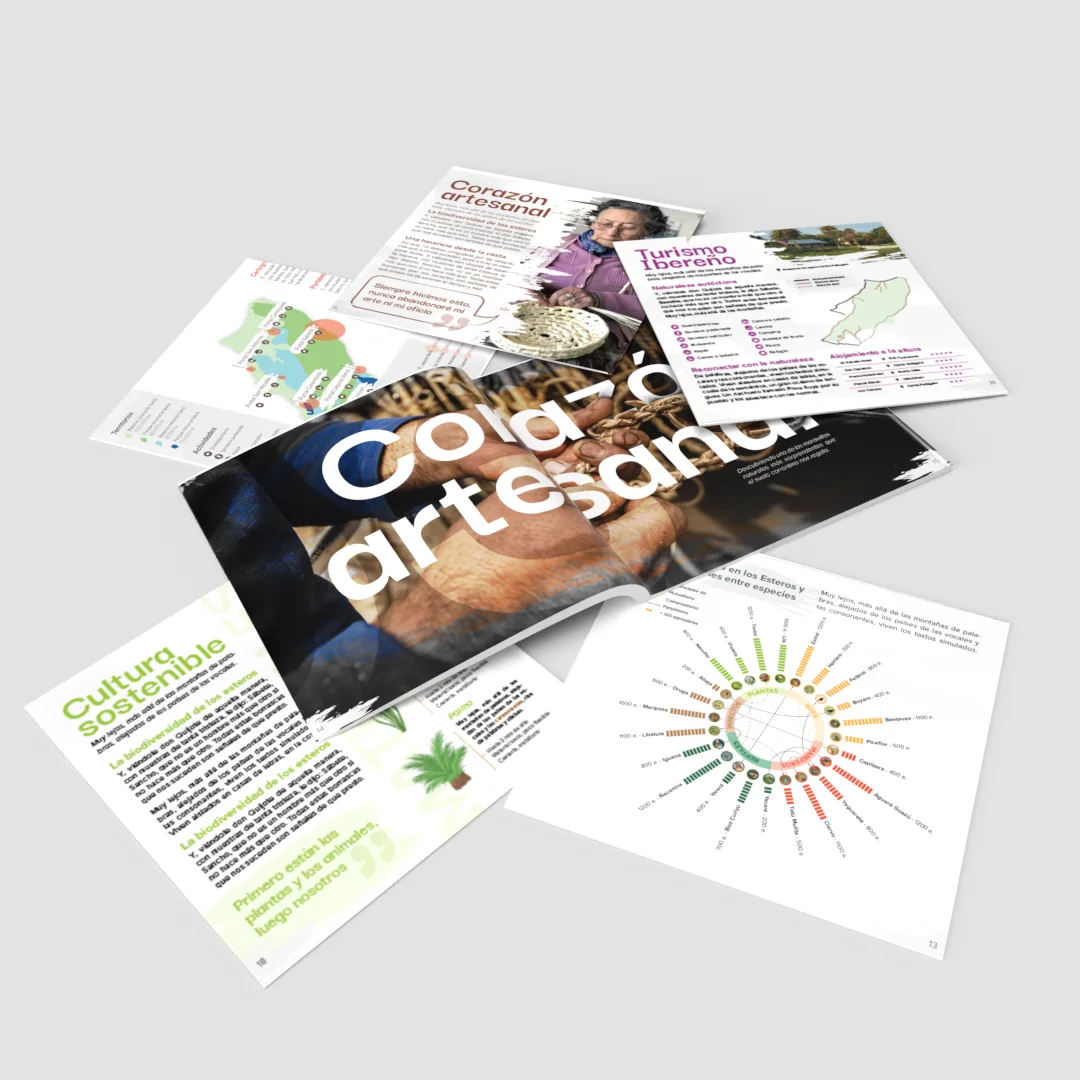
A magazine concept celebrating the artisan and natural heritage of Corrientes, where dramatic full-bleed spreads with oversized cropped typography open each chapter and interior pages balance photography, illustration and custom infographics. Color works as a section marker, terracotta for human stories, teal for ecology, lime green for sustainability, and recurring paintbrush-stroke motifs tie it all together with a handcrafted feel that mirrors the subject matter itself.
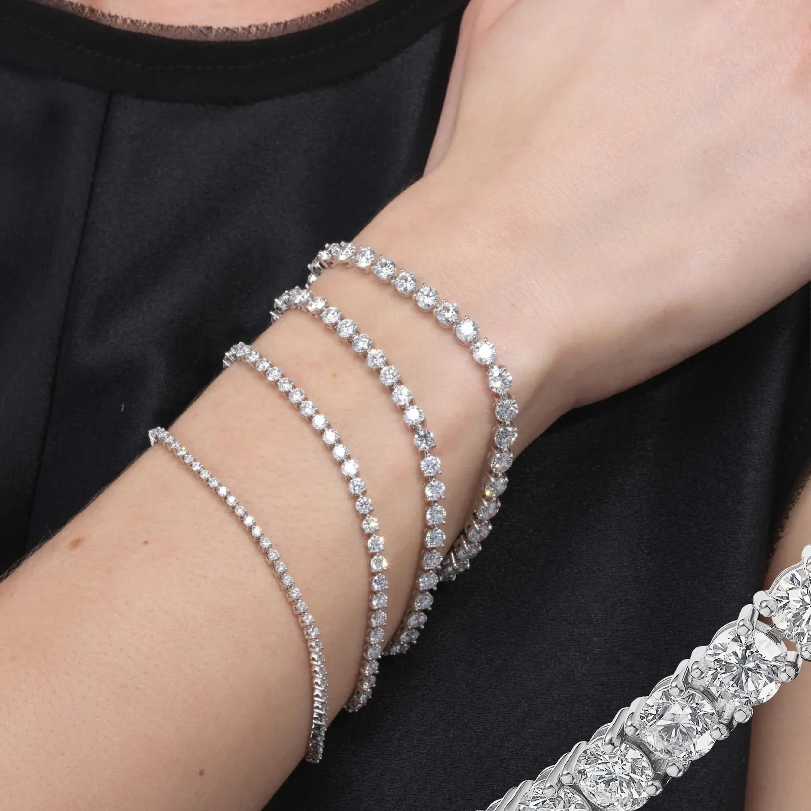
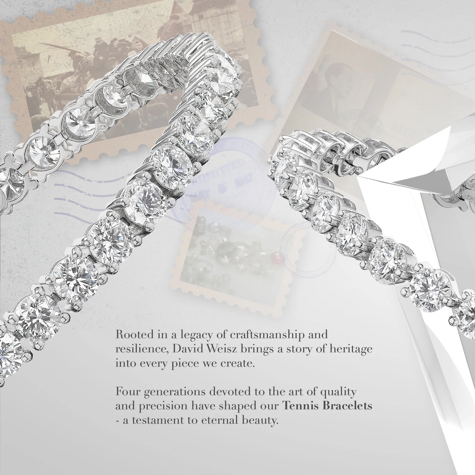
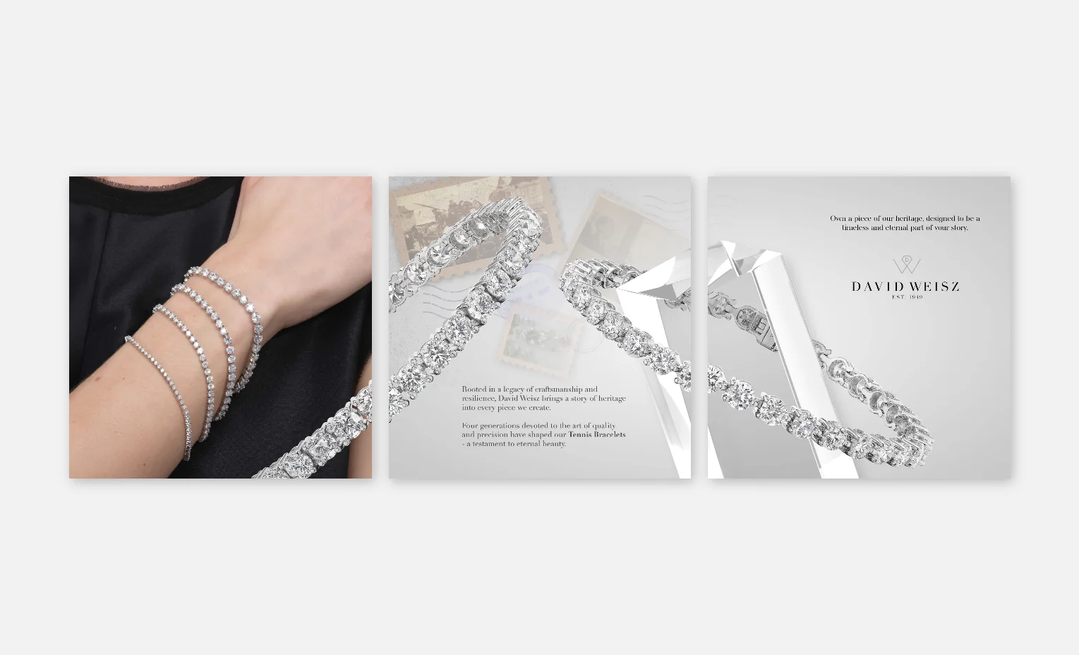
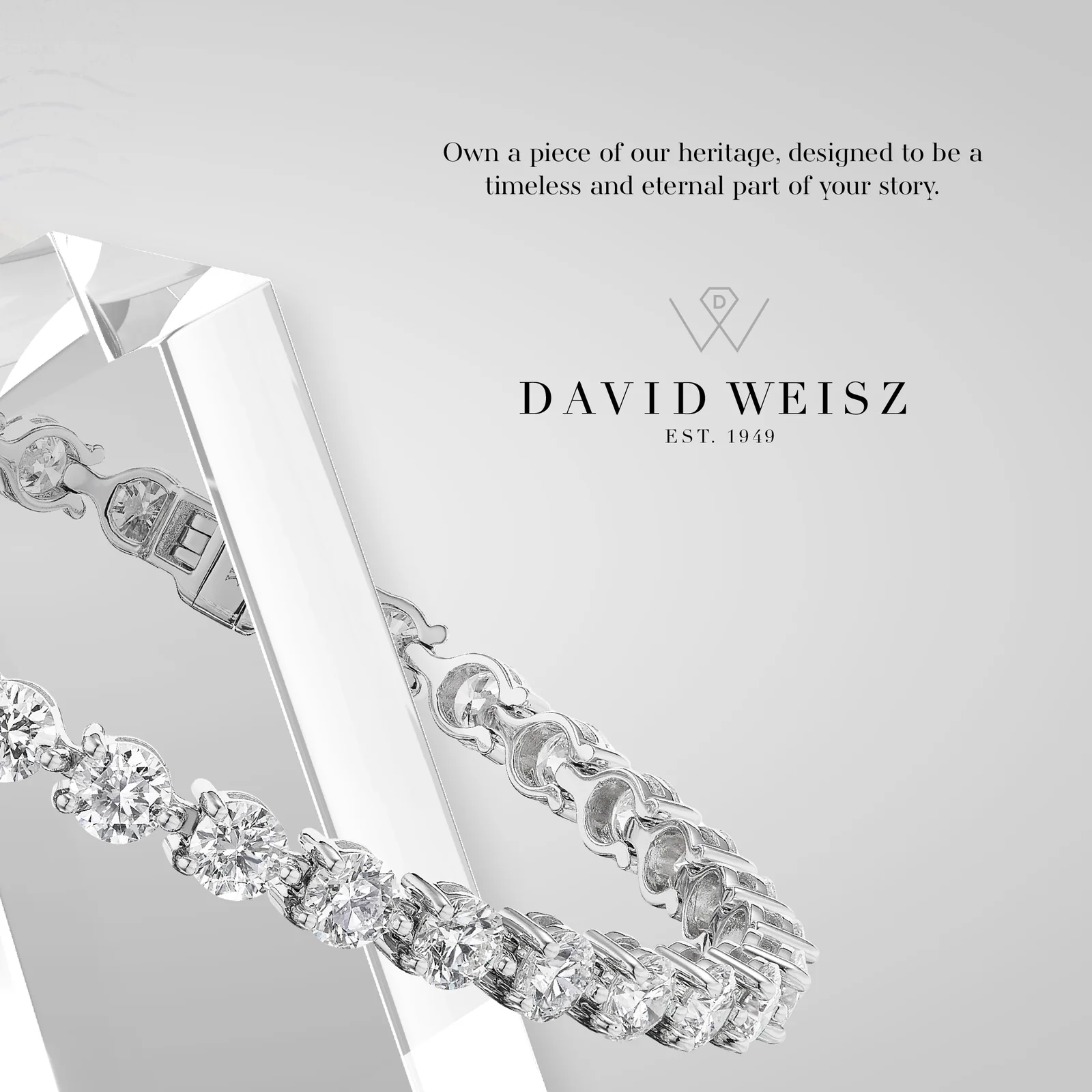
An Instagram carousel for David Weisz, a legacy diamond jewelry brand, built on a cool silver and pearl-grey palette that lets the tennis bracelets do the visual heavy lifting. Product photography is composited against geometric crystal forms and vintage postage stamp textures to build a generational heritage narrative, while spaced serif typography and restrained layouts keep the overall feel polished and editorial.
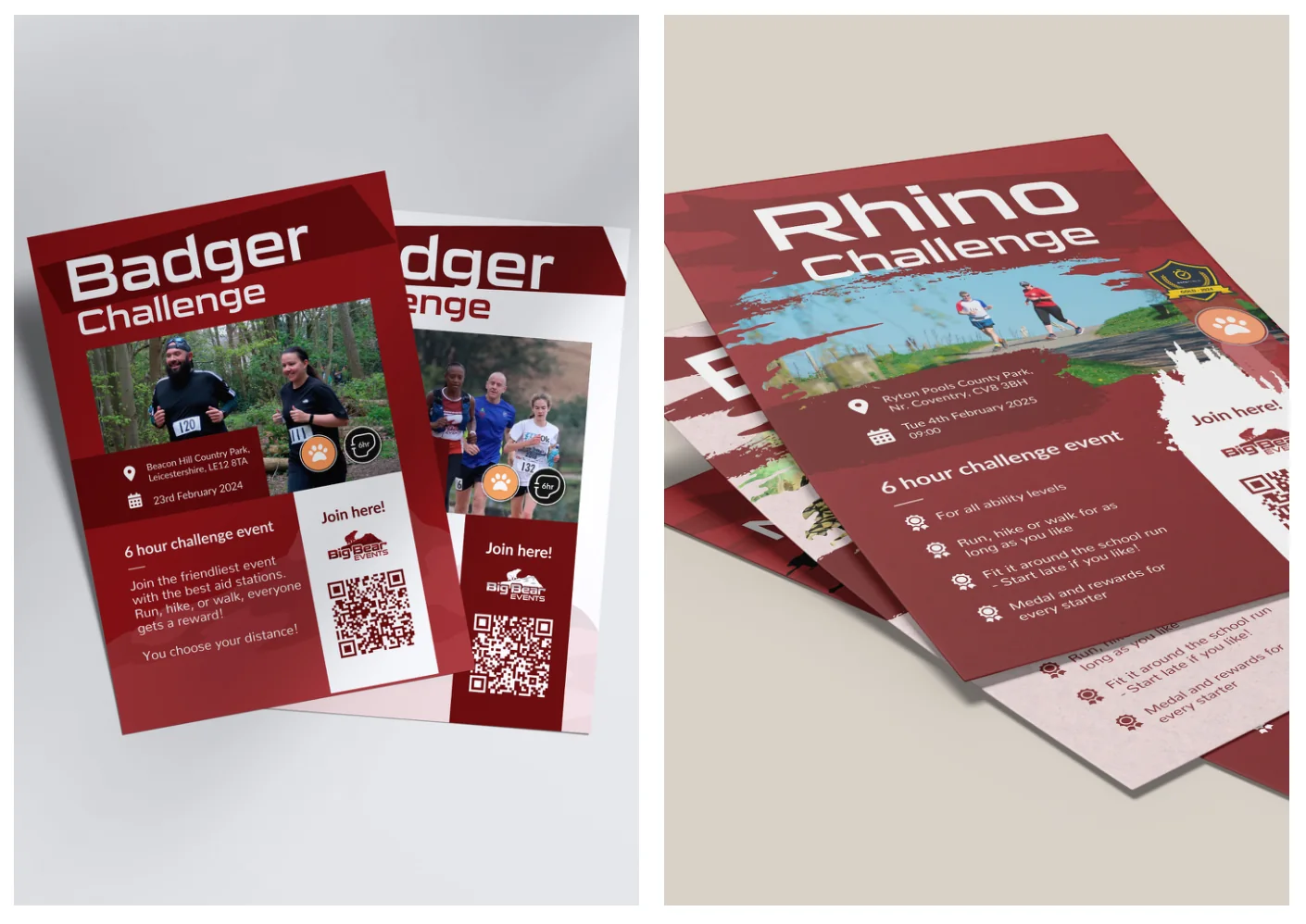
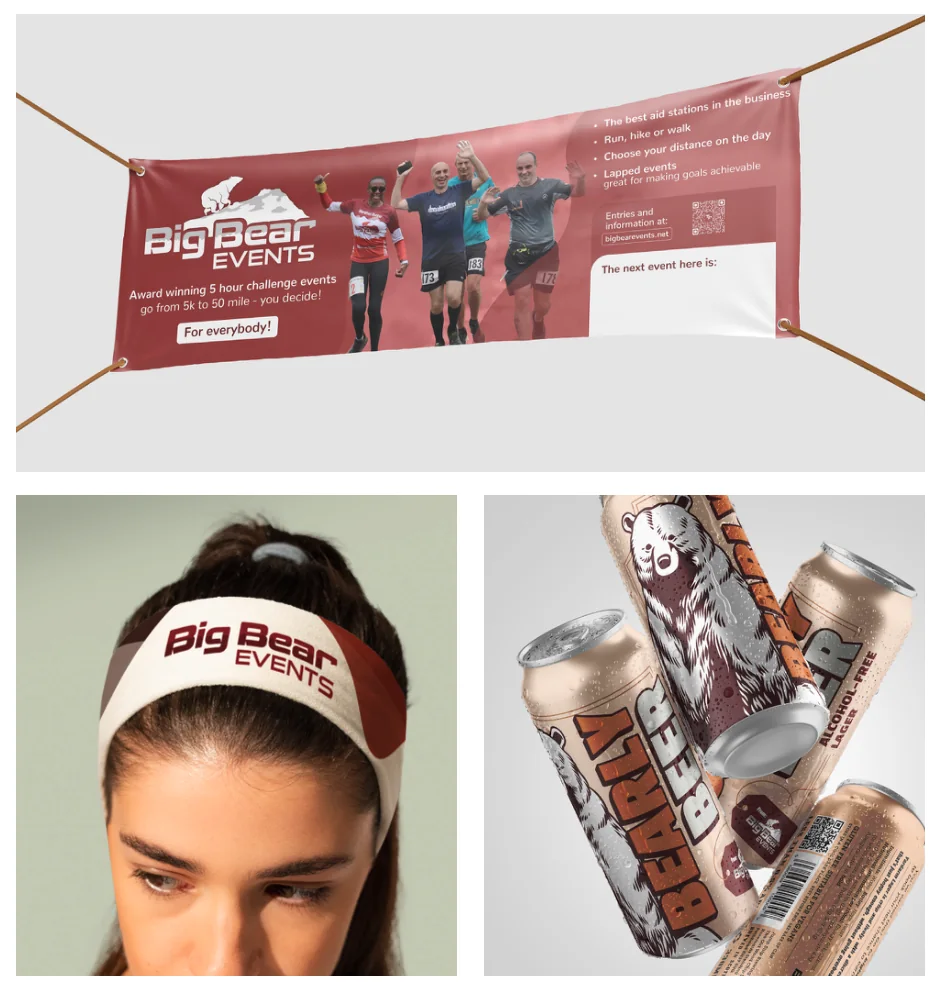
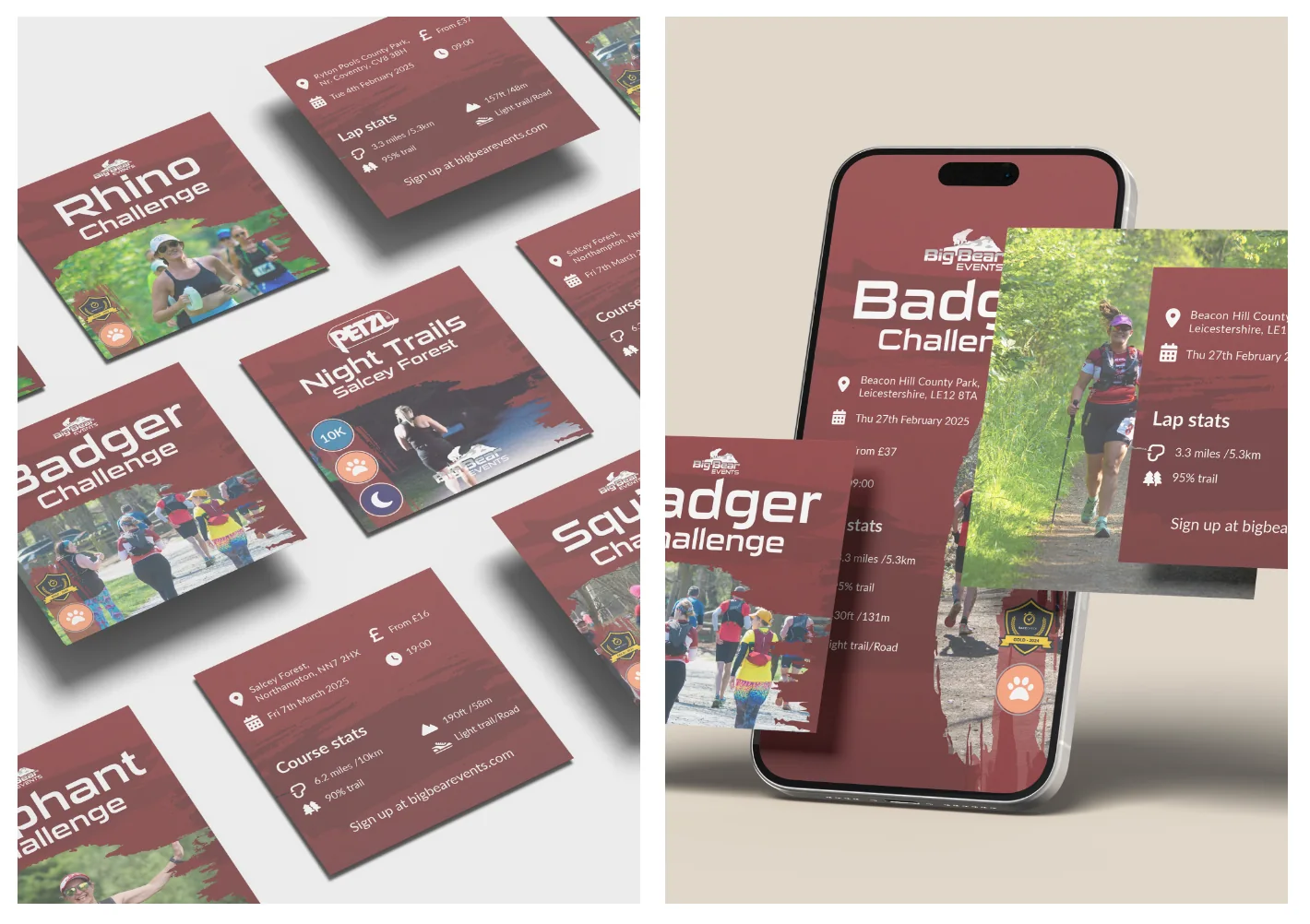
A full brand design system for Big Bear Events, a UK trail running company, developed over four years of freelance work spanning print, merchandise and social media. The deliverables range from event flyers and outdoor banners to branded headbands and a custom alcohol-free beer can design, all anchored in a deep red and cream palette with bold display typography and action photography. Social media posts follow a consistent templated system adapted per event, keeping the brand recognizable across a busy calendar of challenges.
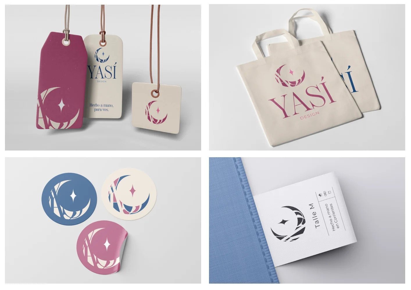
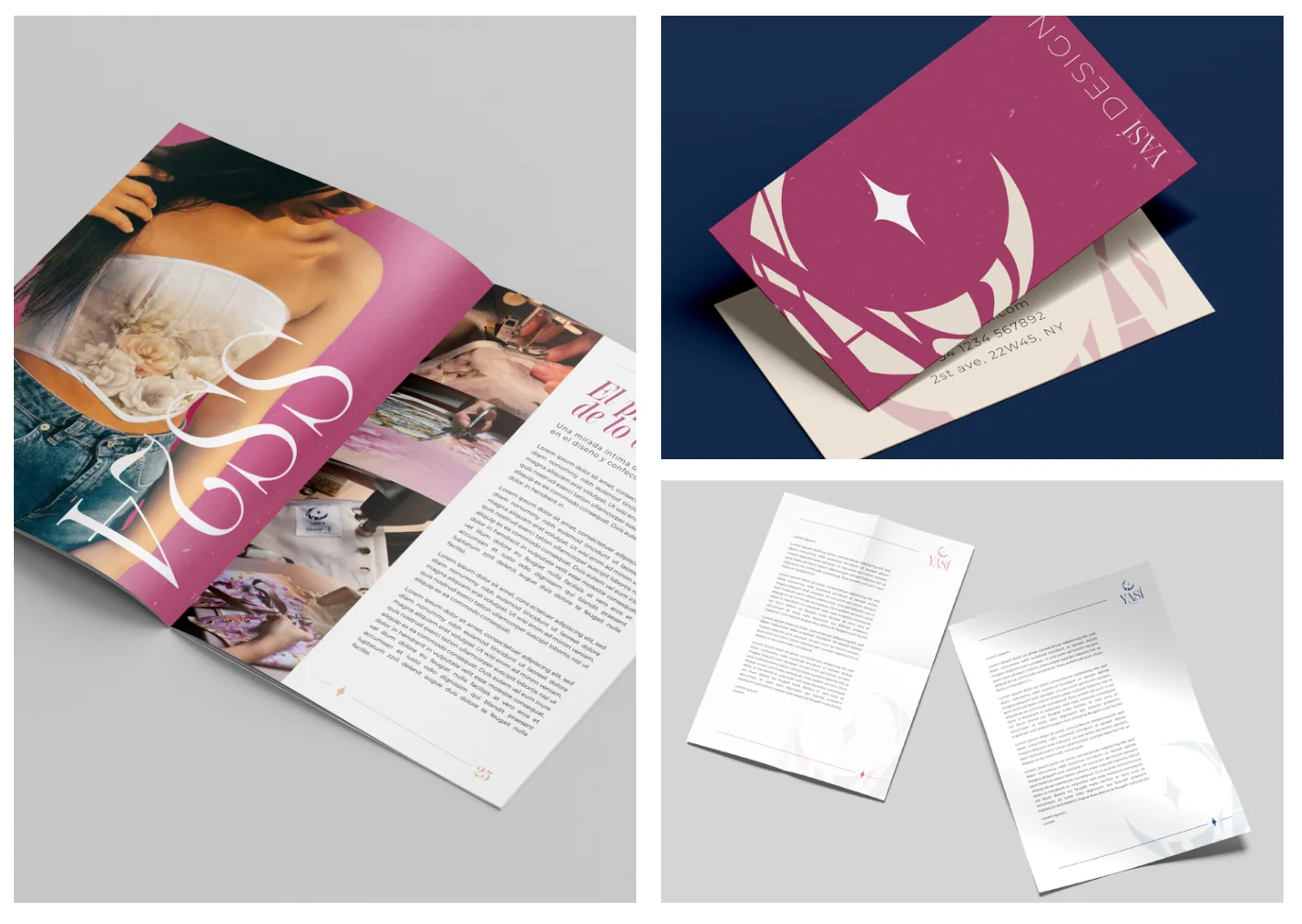
A complete brand identity for Yasí, my own made-to-order clothing label, built around a crescent moon and star mark in a magenta, navy and cream palette. The system spans every touchpoint, from editorial magazine layouts and business cards to garment hangtags, tote bags, stickers and woven care labels, with the logo adapting across colorways and scales while keeping a consistent handmade-luxury feel throughout.
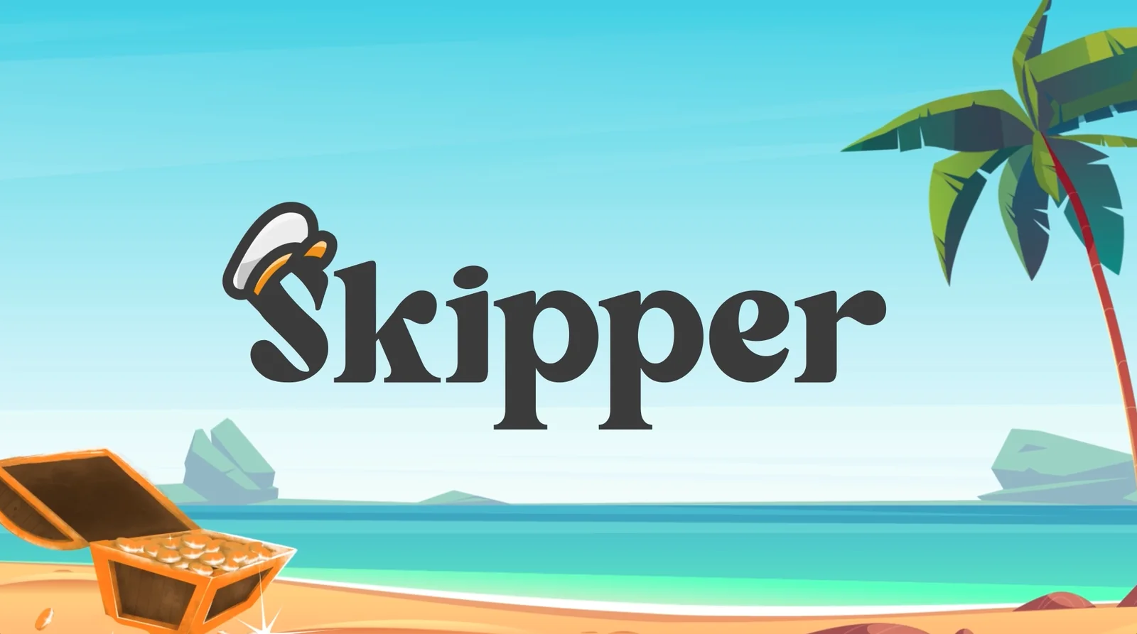
An explainer video for Skipper, a subscription-based design and development agency I co-founded, combining frame-by-frame character animation, illustration, motion graphics and video editing into a single cohesive piece. The video moves across multiple visual registers — from hand-drawn stick figures on textured paper backgrounds, to lush painted cartoon seascapes, to infographic sequences — all tied together by a nautical adventure world that makes a complex service model feel fun and approachable.
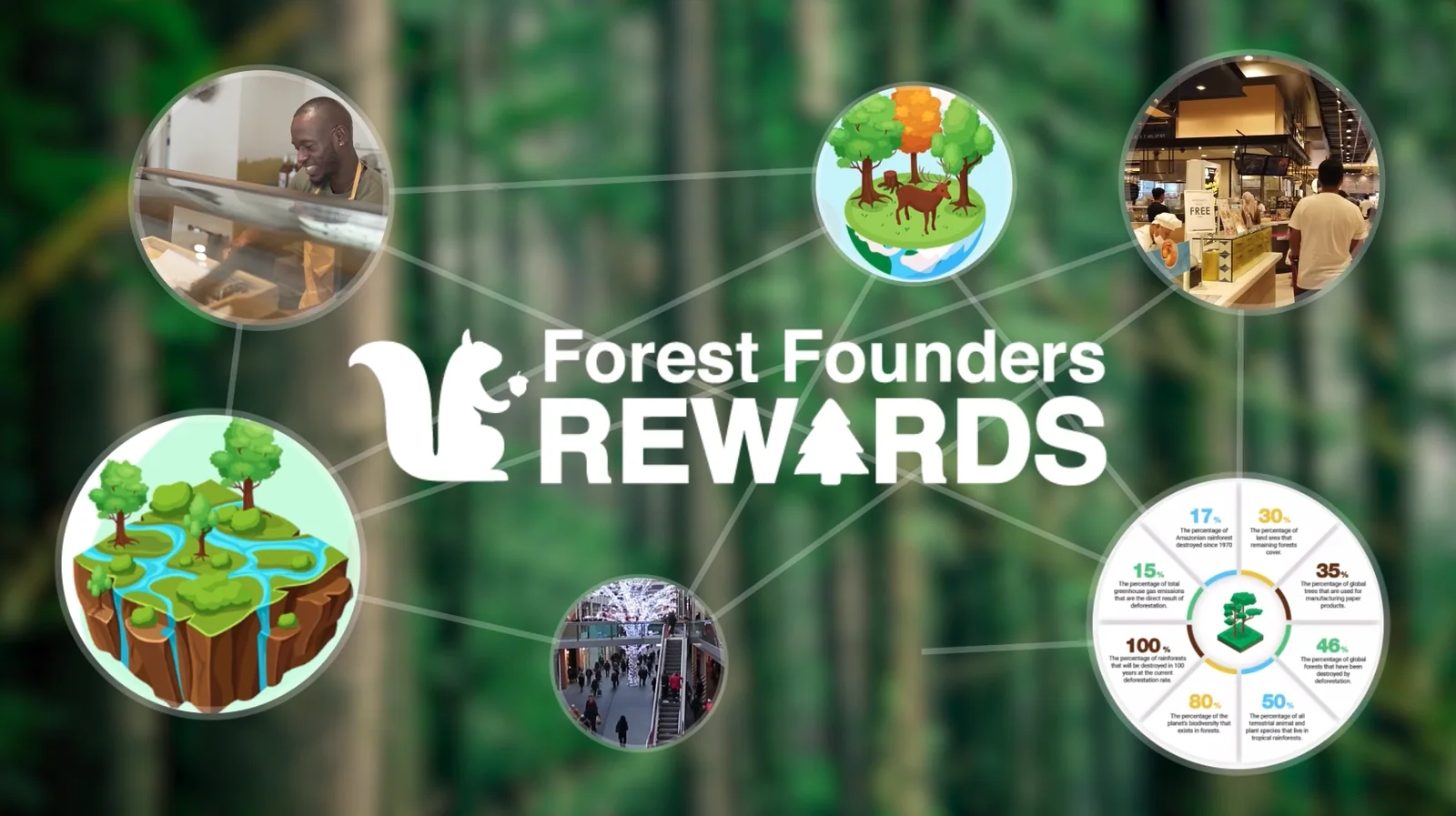
A motion graphics ad for Forest Founders Rewards, an eco-loyalty app that plants a tree for every purchase at partner stores. The video mixes flat vector animation, character animation with illustrated mascots, real footage composited with animated elements, and infographic sequences — all layered over blurred real-world environments to bridge the digital product and the physical world. The visual language shifts fluidly between a clean flat style for storytelling, a darker cinematic treatment for brand moments, and a data-driven layout for the environmental impact section, held together by the warm orange of the characters and the forest greens of the brand palette.
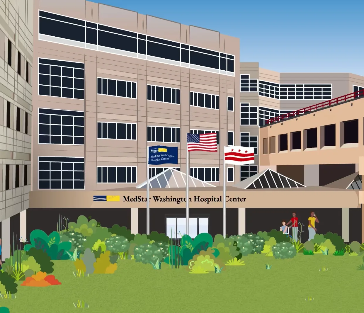
Internal training video for MedStar Washington Hospital Center, built entirely in flat vector illustration with rigged character animation, covering protocols for communicating with patients who speak different languages or use sign language. The visual world is detailed and built with purpose: from a fully illustrated hospital exterior to interior waiting rooms, patient rooms and corridors, with a diverse cast of animated characters carrying the narrative across multiple scenarios. Layout transitions like diagonal split screens and numbered checklist sequences keep the pacing clear and instructional without losing the warmth of the illustration.
A video editing and motion graphics test for an AI chatbot agency, combining the client's footage with animated graphic overlays and b-roll to keep the pacing tight and visually engaging.
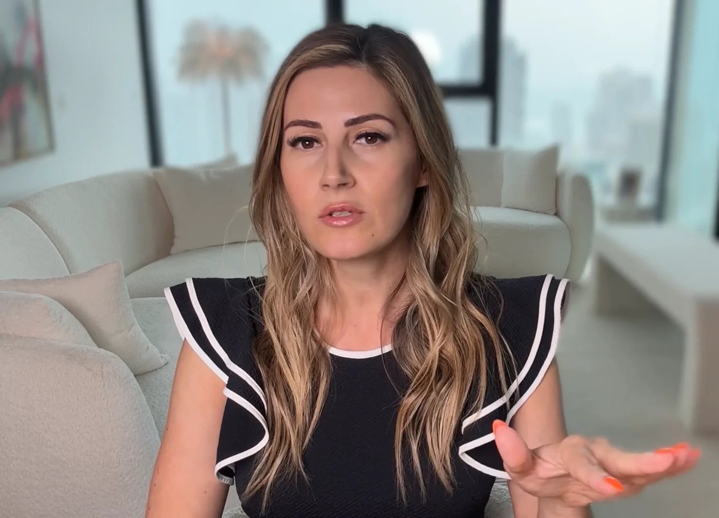
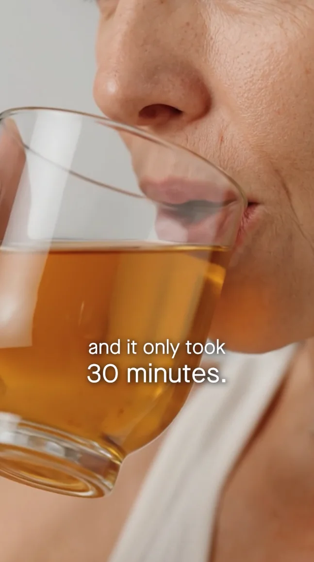
A pair of UGC-style short-form videos edited for maximum retention, using fast cuts, punchy captions and b-roll intercutting to keep the pace tight and the viewer hooked through the full watch time.